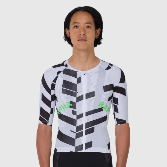
Which idiot at Rapha thought up the sideways logo on the ribs? It just looks cheap and dumb. The Brevet jerseys were ruined by the enormous logo on the back a while back, and now most other cool jerseys are getting this silly crooked thing. Bah humbug.
by gott_in_nizza

11 Comments
In Aero, that’s horizontal.
I’m not generally a Rapha fan but I think this looks quite fresh and interesting. Not sure why it reads as cheap to you. Logo branding is very in atm although it’s generally always popular in brands like Rapha that have made a name for themselves
Walmart designz
People when Rapha doesn’t risk anything: booooooooooooring, minimalist shit
People when Rapha tries something a little bolder: well not like this, disgusting
I agree with you. Rapha lost its design chops years ago. Still good stuff but less motivation to upgrade from the older stuff.
I actually really like this logo placement. When in riding position it is pretty close to horizontal and looks super sharp.
logo placement looks good. go polish your lump of coal
It looks like gills.
This looks like budget MAAP kit from AliExpress
There’s so many other jersey companies and styles, just look elsewhere.
I like all these jerseys